Google Ads integration
Integrations Team: Laura Lawrie (Principal Product Manager), Carrie Taylor (UX Principal), Dirk Petersen (Lead Content Strategist), Joe Lam (Staff Engineer), Miles Stanfield (Frontend Engineer), Ayana Reddick (Backend Engineer)
Project overview
This project was initiated to solve a pain-point for high-revenue, large-scale customers and to help CallRail become more competitive up-market. Users with parent accounts managed integrations on child accounts, often repeating the same task flow 50 times. We designed a one-to-many solution to manage multiple Google Ads integrations across child accounts in a single task flow, and during this project we also designed an extensible pattern that improves the usability of integrations setup. This was an exemplar project for cross-functional collaboration and a junior designer shadowed this project for mentorship and training.

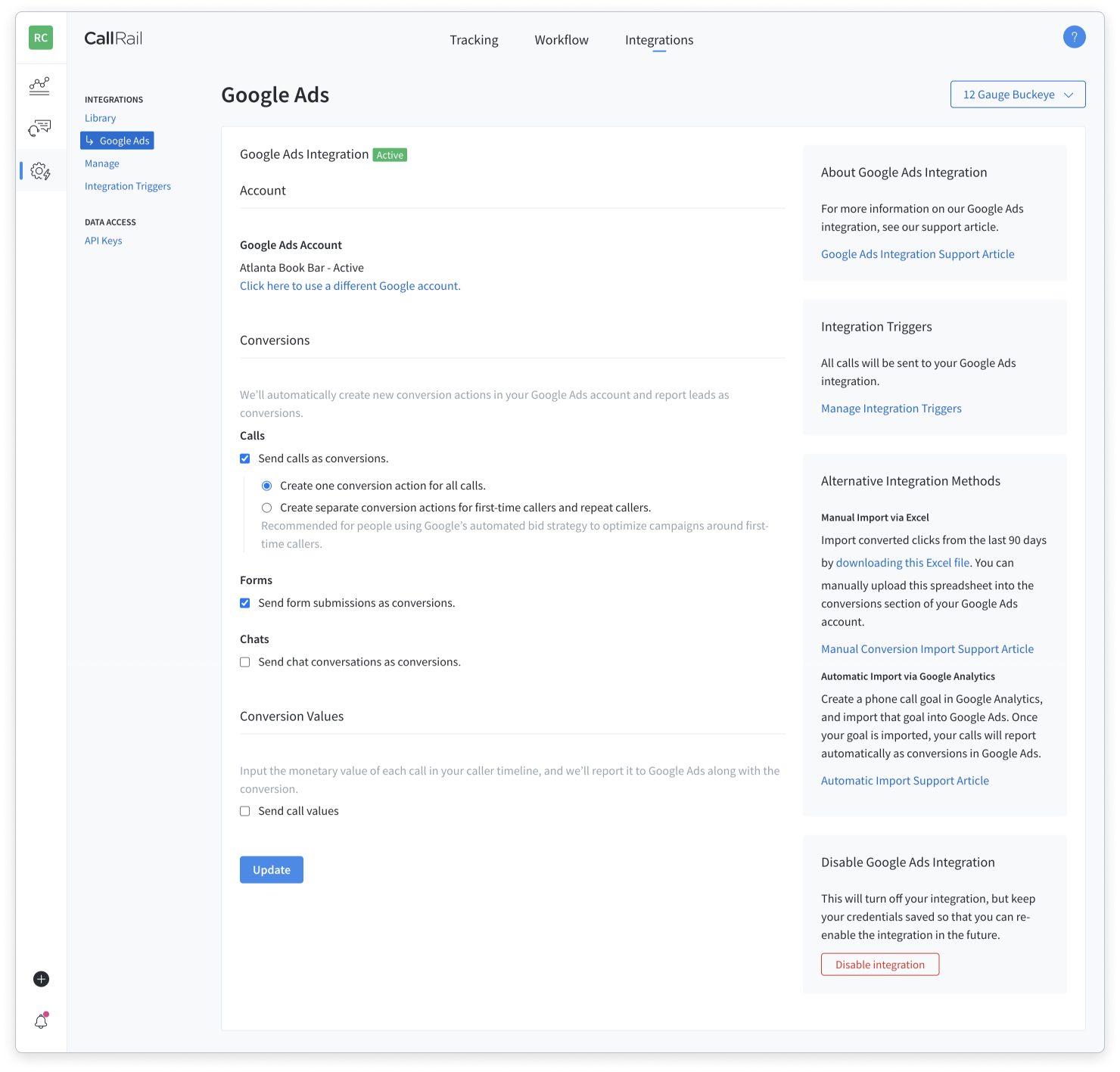
Updated design for parent accounts
At-a-glance view of child-account integrations and settings with improved information hierarchy.
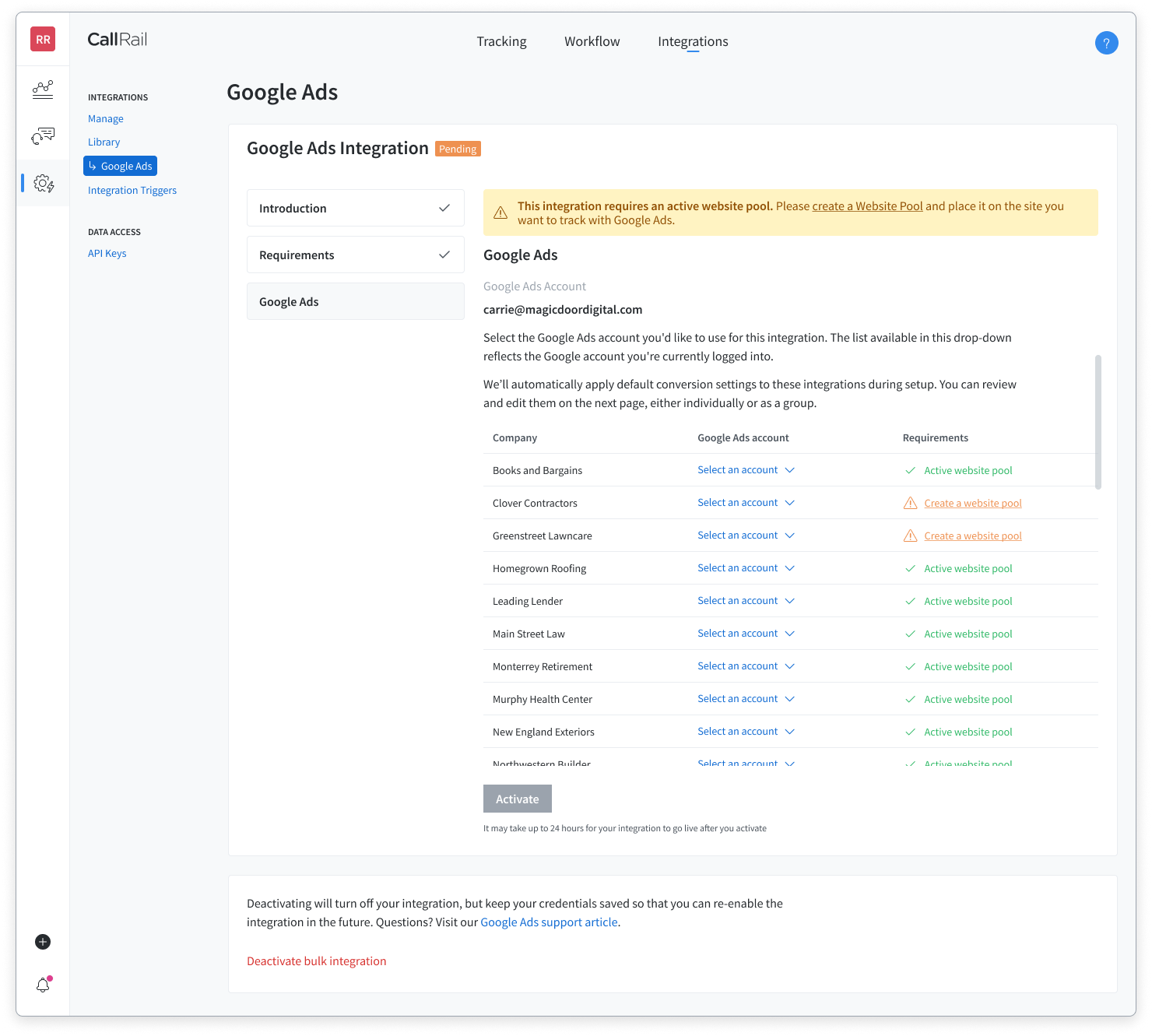
Previous design for child accounts
Users had to repeat integration activation and updates for each child account using a dropdown button to switch child accounts.
Understanding the problem
The first step of my design process is to quickly understand as much as possible before we begin design thinking activities. Combining backend technical requirements with qualitative and quantitative research allows the team to establish a foundation of understanding that sets us up for success.
We met with our Staff Engineer to diagram our understanding of the authentication process and account setup between Google Ads and CallRail. Since CallRail did not have a user researcher dedicated to the project at the time I was reviewed past user interviews, spoke to customer success managers, and used analytics tools to learn about our target users.
Integrations often have multiple steps and configuration states, so I used FullStory session replays to map flow diagrams of current user experience with active, pending, and failed Google Ads integrations. In addition to mapping these flows and understanding the current experience, I collected quantitative behavioral data from FullStory in a Google Sheet which helped to segment users for benchmark metrics as well as understanding the scope of users who will be impacted by the new design. Adding qualitative insights and quotes from past user interviews to this collection provided the team with a clear picture of the problem space and target users.
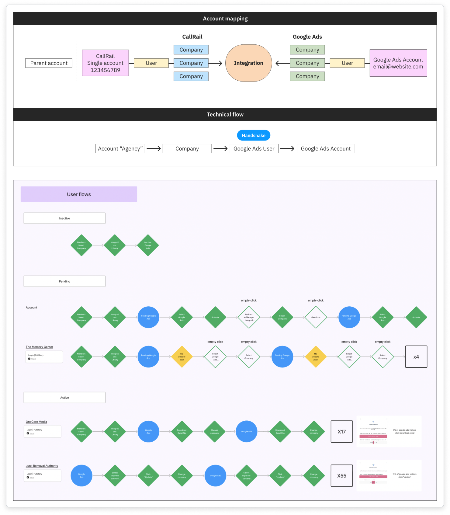
Diagrams and mapping
Diagrams are helpful to reference throughout the project and are great for team alignment.
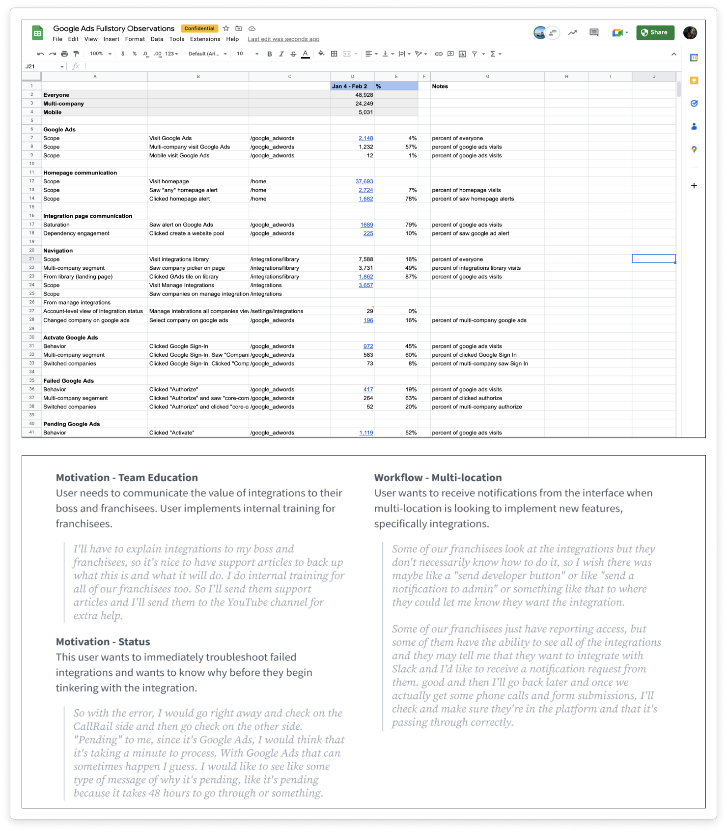
Quantitative and qualitative
Triangulating data with mixed-methods research builds a solid foundation for understanding.
Collaborating as a team
This was a new cross-functional team, so it was critical that we establish a foundation for frequent communication and clear expectations. One week after our project kickoff, I facilitated a brainstorming session in Figjam with the cross-functional team for awareness, alignment, and direction. First, I presented the research and shared a FullStory session recording of our target user before we spent a few minutes to collect assumptions and then a timed sketching exercise. We had a productive discussion around ideas and constraints and the UX partners had some rough ideas to refine into user flows and concept sketches.
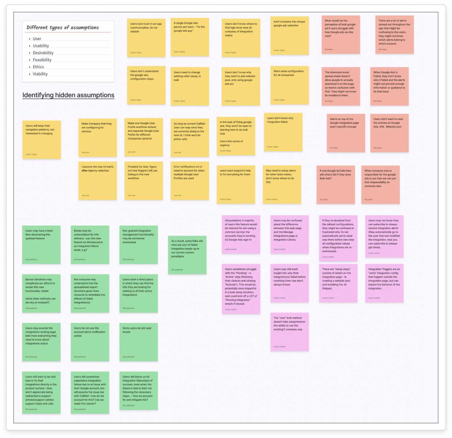
Collection of assumptions
Identifying and sharing assumptions helps to quickly assesses risks and unknowns.
Crazy 8s sketches
Brainstorming with the cross-functional team helps build alignment and relationships.
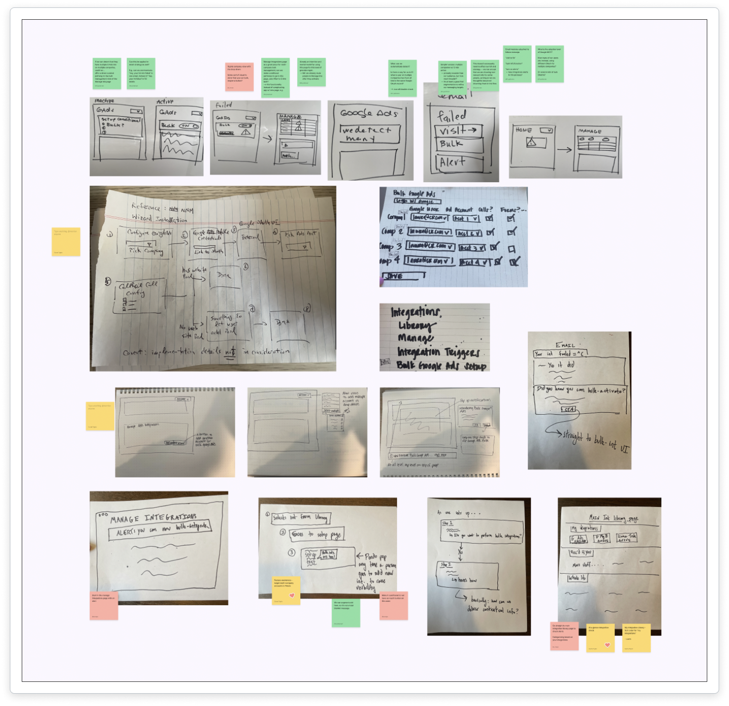
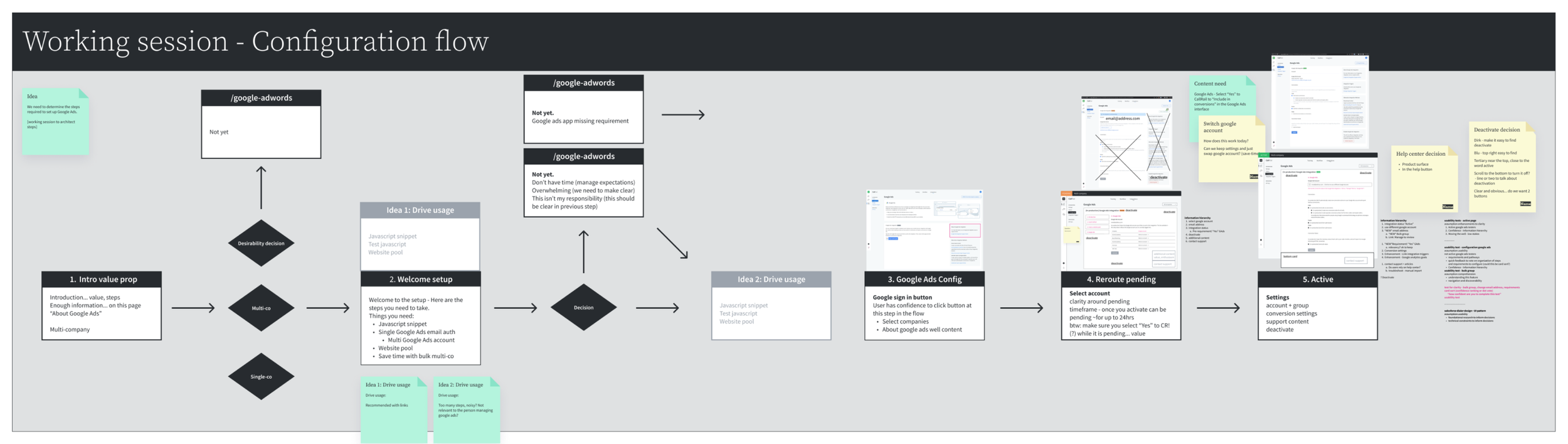
Working towards a solution
The user experience team held a working session to expand and refine ideas from our cross-functional design thinking session. I drew basic fat-marker sketches to facilitate our conversations, and we added details and built out flows with the goal of presenting this concept to product leadership for our gut-check milestone. Ideally, we would want to test these concepts with users, but since we didn’t have a researcher or participants, we had to be resourceful. So after we iterated further with our cross-functional team, we shared this concept with customer success managers to learn if this meets our target users’ needs. We collected the feedback we received in stickies and Figma comments, and were ready to continue refining our design.
Low-fidelity concepts
It’s important to source feedback early and often, so these fat-marker sketches were successful in communicating our concept.
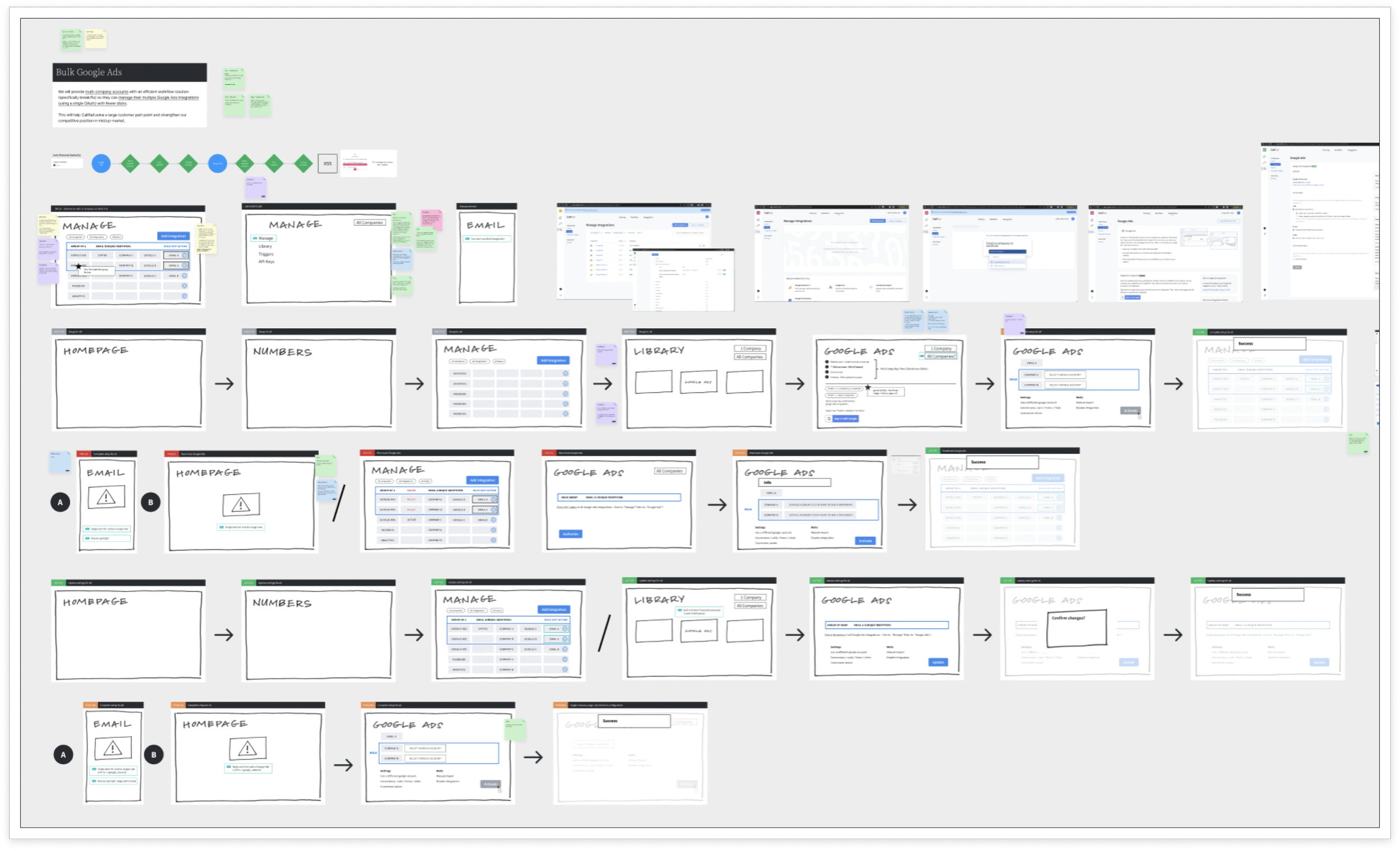
Testing and refining the design
Since our concept was approved, the Lead Content Strategist and I built flow diagrams and mapped the user journey to guide our more detailed wireframes. Using this map, we could focus on information hierarchy of each page to guide the content design and key moments in the user experience. Working in low-fidelity allowed us to stay aligned and move quickly setting us up for success to work asynchronously on our more focused disciplines. I designed mid-fidelity wireframes for early phases of interaction design and UI of the new pages.
User flow diagram and content mapping
Collaborative working sessions kept the team aligned and allowed everyone to contribute to the overall design.
Mid-fidelity wireframes
The user flow diagrams guided the focused work of designing mid-fidelity wireframes.
Designing high-fidelity wireframes
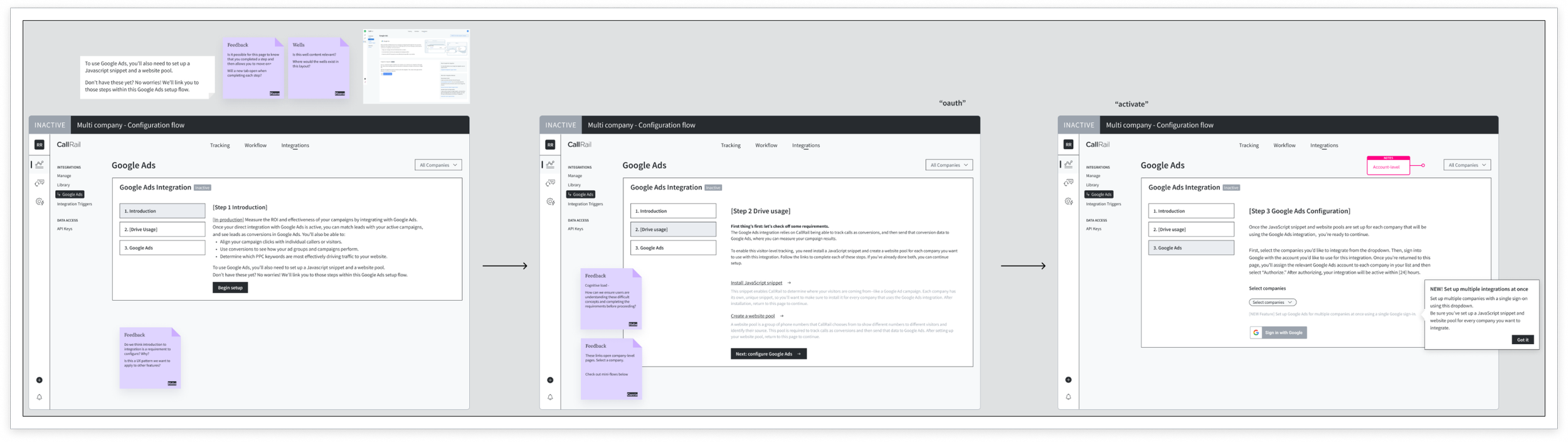
In my research, I discovered that users often abandoned their Google Ads integration setup in a pending state, or they attempted to configure it without all of the requirements met. So we designed and built a new stepper pattern for our platform with the goal to implement this for all integrations. I collaborated with design system stakeholders and engineers to build this as an extensible pattern. We decided that Google Ads was the first location to build this pattern because it is one of our most popular integrations and the requirements drive revenue for the business.

Stepper design: Requirements
Stepper experience to help guide users with links that open a new tab to complete requirements.
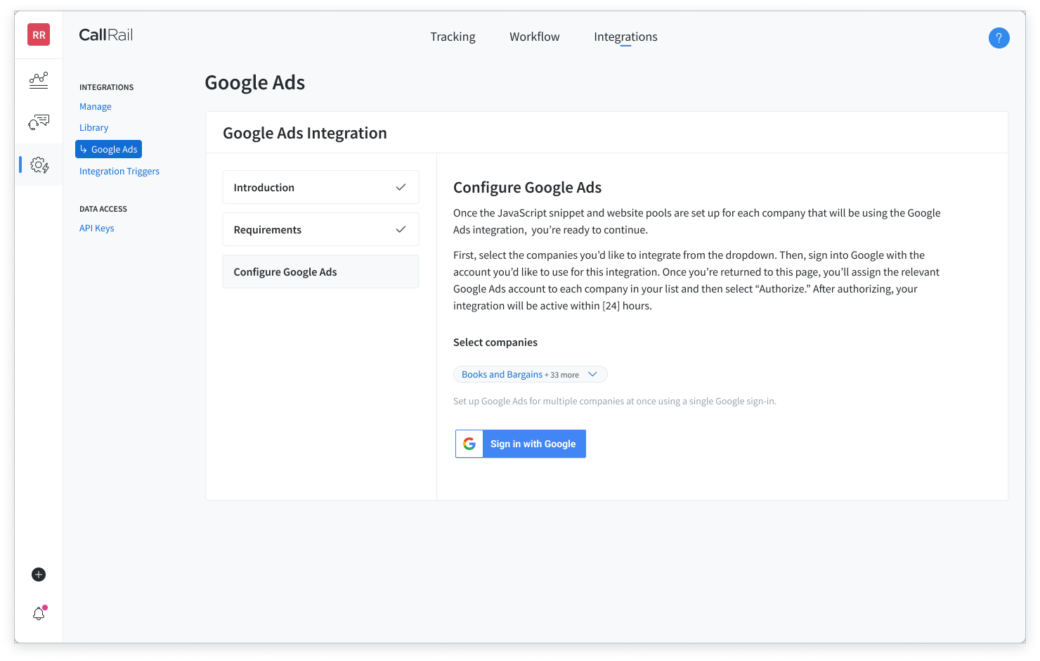
Stepper design: Authenticate
Multi-select child accounts to begin authentication process with a single click.
Users need to fix broken integrations quickly and with minimal clicks, so I redesigned the integrations page with visibility and action in mind. We rearchitected the page by using cards to group information and we removed the primary button from the active integration page because no action is needed. I am passionate about designing pages and experiences with user goals in mind.
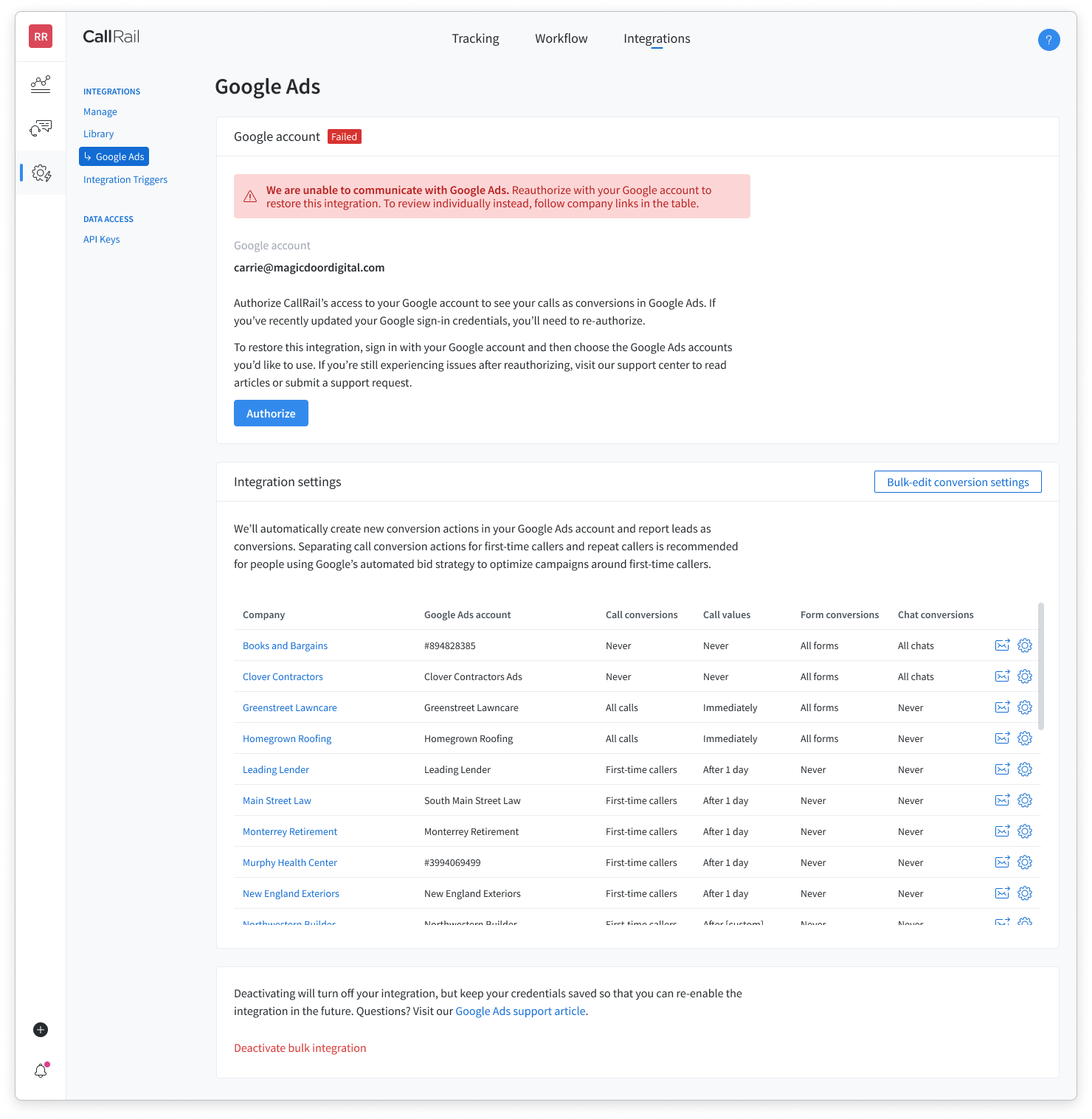
Failed integration
Primary button and in-line alert helps guide users to take necessary action.
Active integration
Users can bulk configure their integration including updating their account, edit settings, and deactivate.
Measuring success
This feature was launched in December 2023, and I am excited to measure and share the impact of the design.